
Modeling the COVID-19 / Coronavirus pandemic – 1.Background Data
This is the first in a series of posts in which I study the COVID-19 (coronavirus) pandemic. My original goal was to understand the behavior of the pandemic. As a scientists my curiosity forces me to not to leave such problems untouched. I wanted to know what are the possible outcome scenarios possible and what are the steps required to reach them. Is there a reasonable solution in which we avoid the collapse of health systems and/or the economies? I am sure (well, I hope) that professional epidemiologists know all of this, I decided to share with whomever is interested in my insights. A note of caution. First year college education in harder sciences or engineering is needed to appreciate everything.
Just as a background. I am a professor of physics at the Hebrew University. My bread and butter are problems in astrophysics (massive stars, cosmic rays) as well as understanding how the sun has a large effect on climate (though modulation of the cosmic ray flux) and its repercussions on our understanding of 20th century climate change, and climate in general.
As I write this text (Early April), the pandemic is raging. It infected over 1.5 million people world wide and killed over 80000. In many places it is still growing exponentially. In Israel (where I live), the situation appears to be getting under control, with around 10000 infected, of order a few % daily infection rate (and decreasing), and 70 or so dead, i.e., just over half percent, which is actually good compared with other countries, as can be seen here for example).
Anyway, the goal of the notes is to model the pandemic, understand it, and hopefully reach positive constructive conclusions. These are especially important if we are to understand how we leave the lockdowns most of us are now in. In order to so, we need some useful data. So, the rest of this post is dedicated to summarize various useful results I found in various preprints, as well as the pandemic growth data from different countries that I plotted using available data. The subsequent posts will be dedicated to understanding the pandemic with models of various complexity.
Number of Infected and its growth rate in different countries.
Data on the infection at different countries is collected by the John Hopkins University Center for Systems Science and Engineering, and kept in a data repository on Github. This data can then be used to plot the number of infected as a function of time. This is done in fig. 1 below. The majority of western countries appear to have grown from 100 to 1000 infected in 7.5 ± 2 days, or a rate of about 0.305 ± 0.065 e-folds per day.
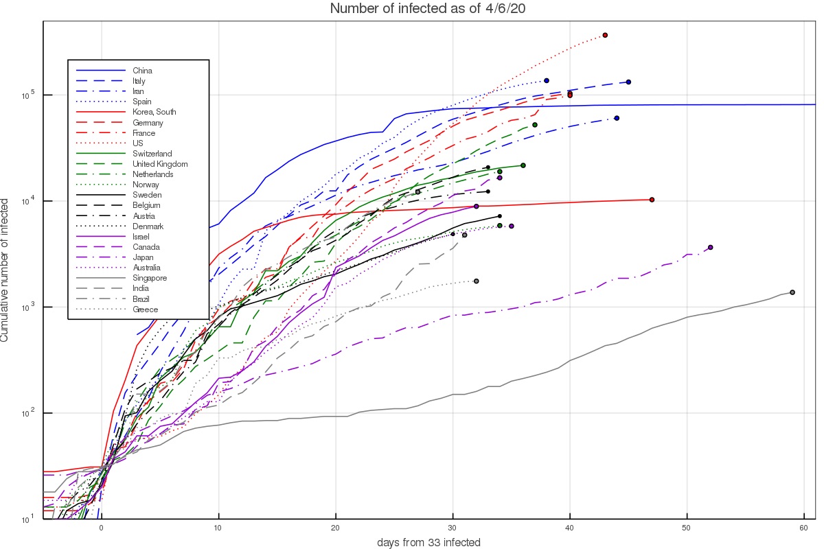
There are several interesting exceptions. First, there are countries in which the growth was notably faster. In Iran this can be explained given the dense environment and significant interaction at religious places. The infection growth started in the city of Qom which is an important Shia center. In South Korea it started with a super spreader at the city of Daegu (in a Christian center). In Italy and Spain fast initial growth is attributed to the Champion league match between Atalanta of Bergamo and Valencia, taking place in Milan.
On the other hand, there are several countries with slower growth. This includes Israel which already had quarantine measures taking place before the first community infections took place, as well as Australia and Canada. It could be slower in the latter countries either because the weather is notably hotter/colder, or perhaps the typical interaction in those societies is lower. The lower infection in Japan and Singapore can probably be attributed to the social standards requiring for example facial masks by anyone who has any cold or flu like symptoms. In Japan, without any quarantining or lockdowns, the growth rate was around 0.075 ± 0.025 e-folds per day.
Another way of depicting the growth is to calculate the growth rate at each day, based on the preceding 5 days. This results in figs. 2 and 3, which depict the growth rate and the number of infected per day based on the 5 day fit (and thus average out some of the day to day variations). During the time of the pandemic, the figures are updated almost everyday and published on twitter under my handle @nirshaviv.
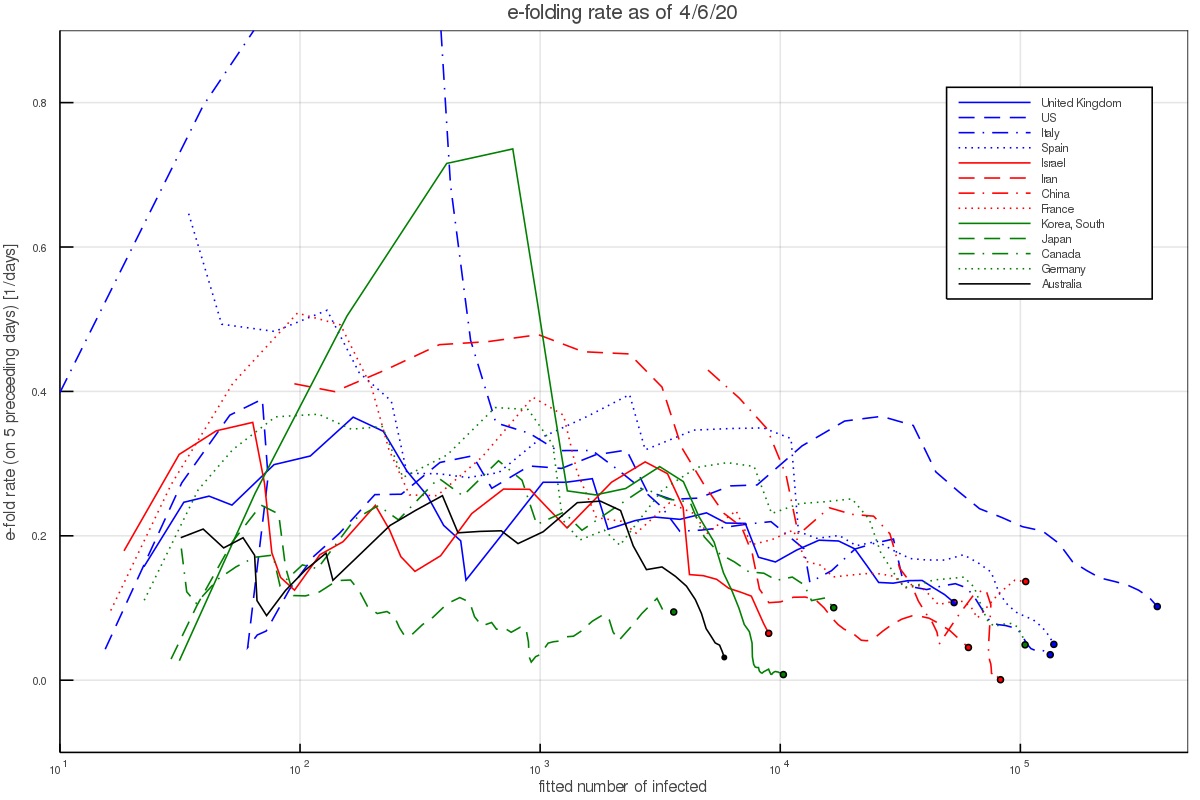
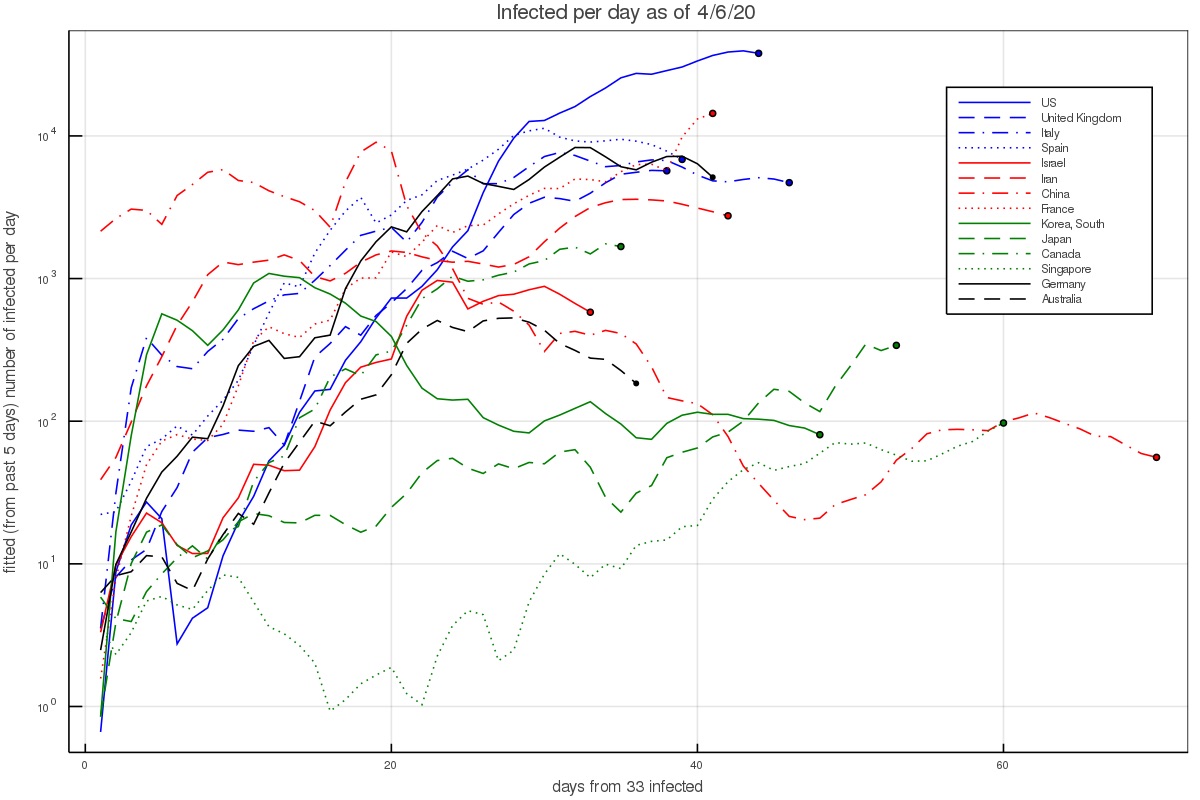
Fig. 2 shows that when there are a few hundred to a few thousand people, which is after the pandemic took hold in a country but before countries took measures or have them affect the growth, the aforementioned rate consistently describes the data (except for the outlier countries mentioned above).
Incubation period
The incubation period is the time between exposure and infection by an infected person and the appearance of the first symptoms. Given that self isolation can take place after the first symptoms show up, the incubation period is crucial for estimating whether a corona outbreak can be reined in naturally.
For the incubation period we take the probability distribution function fitted for by Lauer et al. 2020. They fitted several functional forms which give similar fits. We shall work with the Γ-distribution for consistency with the serial interval fits we use below. Their best fit is a gamma distribution with a shape parameter of 5.807 (95% CI of 3.585-13.865) and a scale parameter of 0.948 days (95% CI of 0.368-1.696 days). This gives a mean of 5.1 days.
These results are consistent with Li et al. 2020 who find an incubation period (mean time between primary infection and appearance of symptoms ) of 5.2 days (with 95% confidence between 4.1 to 7.0 days).
Serial Interval and infection as a function of time}
Another extremely important piece of information in how infectious are people with the corona virus, and how it depends on time.
By limiting themselves to reliable infection lines, Nishiura et al. 2020 find a serial interval of 4.6 days (with a 95% CI of 3.5 to 5.9). This is somewhat shorter than Li et al. 2020, who find a serial interval (mean time between primary and secondary infection) of 7.5 days (with 95% confidence between 5.3 to 19.0 days).
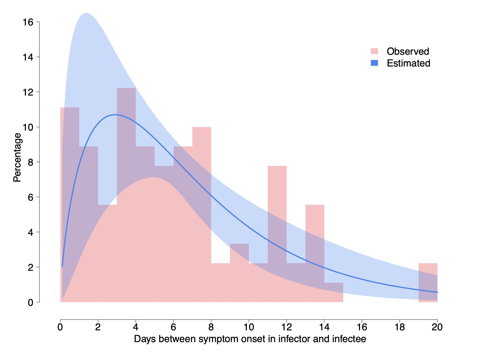
Cereda et al. 2020 carry an analysis of over 5000 cases from the early outbreak in Lombardy Italy from which they derive 90 pairs of cases with known infector-infectee relationship, which is much larger than above. They derive a distribution of cases and fit it with a Γ distribution having a shape parameter of 1.87 ± 0.26 and a rate of 0.28 ± 0.04 day$^{-1}$. This gives a mean of 6.7 days and a median of 5.5 days. In what follows, we work with these distribution and values.
We do note however that although the authors claim it is the serial interval, it is the interval between the appearance of symptoms and not the between the infections. Although the two have the same mean, the interval between the appearance of symptoms should have a somewhat wider distribution because the incubation periods in the infector and infectee are not the same. Using the data on the incubation we can actually correct for this.
The variance of a Γ distribution describing the interval between appearance of symptoms, with the above shape is 23.9 day$^2$, while that of the incubation period is 6.46 day$^2$. The variance of the serial interval should be $\sigma_{serial-int}^2 \approx \sigma_{sympt-int}^2 - (1~\mathrm{to}~2)~\sigma_{incub}^2 = 11.0~\mathrm{to}~ 17.4$ day$^2$. The factor 1 or 2 depends on whether there is a correlation between the infected being infectious and developing symptoms, (1) or whether there is no correlation (2). Thus, we take middle ground, which is a variance of around 14.2 ± 3.2 day$^2$. If we keep the mean to be 6.7 days, we need a shape parameter of 3.1 ± 0.8 and a rate of 0.47 ± 0.12 day$^{-1}$.
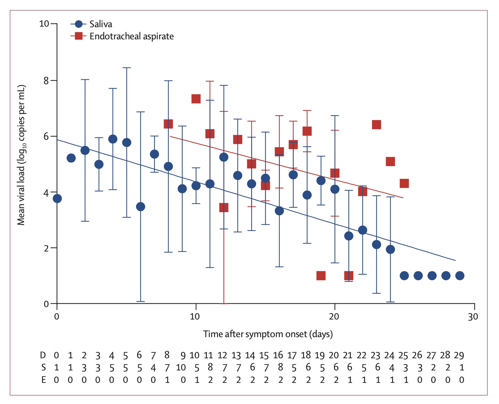
As a consistency check, this rate which describes the exponential decay of how the infected is contagious can be compared with the decay of the viral load measured in infected people To et al. 2020. It was found to be 0.15 ± 0.02 decades per day, which corresponds to a rate of 0.345 ± 0.046 e-folds per day. Note however that the fit here is to a simple exponential decay. If we wish to compare the above fit to the viral load decay, namely, fit an exponential decay to the Γ distribution (say between day 7 and 24, the range over which the viral load decay was measured and fitted), we find an offset of about 0.11. That is, the Γ distribution appears like an exponential with a rate of 0.36 ± 0.12 day$^{-1}$ over this period. It is therefore consistent with the decay of the viral load.
Fraction of asymptomatic infections
Another characteristic of the coronavirus infection which is crucial for the modeling of the pandemic growth is the fraction of asymptomatic infections, as these are individuals which can spread the infection without realizing that they are doing so.
The Royal Princess quarantined in Japan offers the possibility of analyzing a relatively complete sample for the appearance of symptoms in infected individuals. Although it requires some modeling (to model those infected who would develop symptoms after taken off board given the incubation period), the value that they found was 17.5% (95% confidence of 15.5–20.2%, Mizumoto et al. 2020). Although relatively complete and with a small uncertainty, the problem here is that the age distribution of the infected people is highly top weighted. It is not unreasonable that younger populations (of which fewer become critically ill) are also more likely to be asymptomatic. Namely, this number could be suffering from a large systematic bias.
Another less biased estimate is based on the Japanese citizens evacuated from Wuhan gives a fraction of 41.6% (95% Confidence interval 16.7-66.7%, Nishiura et al 2020). This estimate has however a relatively large uncertainty.
Although not officially published, it has recently been circulating that the Chinese authorities estimate that one quarter don't develop symptoms. According to the head of the CDC, Dr. Robert Redfield, this number has been "pretty much confirmed" (e.g., see quote on NPR).
In what follows, we take the the fraction of asymptomatic coronavirus infections is f = 0.3 ± 0.1.
Additional posts in the series include
References
Just as a background. I am a professor of physics at the Hebrew University. My bread and butter are problems in astrophysics (massive stars, cosmic rays) as well as understanding how the sun has a large effect on climate (though modulation of the cosmic ray flux) and its repercussions on our understanding of 20th century climate change, and climate in general.
As I write this text (Early April), the pandemic is raging. It infected over 1.5 million people world wide and killed over 80000. In many places it is still growing exponentially. In Israel (where I live), the situation appears to be getting under control, with around 10000 infected, of order a few % daily infection rate (and decreasing), and 70 or so dead, i.e., just over half percent, which is actually good compared with other countries, as can be seen here for example).
Anyway, the goal of the notes is to model the pandemic, understand it, and hopefully reach positive constructive conclusions. These are especially important if we are to understand how we leave the lockdowns most of us are now in. In order to so, we need some useful data. So, the rest of this post is dedicated to summarize various useful results I found in various preprints, as well as the pandemic growth data from different countries that I plotted using available data. The subsequent posts will be dedicated to understanding the pandemic with models of various complexity.
Number of Infected and its growth rate in different countries.
Data on the infection at different countries is collected by the John Hopkins University Center for Systems Science and Engineering, and kept in a data repository on Github. This data can then be used to plot the number of infected as a function of time. This is done in fig. 1 below. The majority of western countries appear to have grown from 100 to 1000 infected in 7.5 ± 2 days, or a rate of about 0.305 ± 0.065 e-folds per day.
Figure 1 - The number of infected people in selected countries as a function of the time interval since that country had 33 infected. At earlier times small number statistics play a major role, while at much later times counties implemented quarantining and lockdown measures.
There are several interesting exceptions. First, there are countries in which the growth was notably faster. In Iran this can be explained given the dense environment and significant interaction at religious places. The infection growth started in the city of Qom which is an important Shia center. In South Korea it started with a super spreader at the city of Daegu (in a Christian center). In Italy and Spain fast initial growth is attributed to the Champion league match between Atalanta of Bergamo and Valencia, taking place in Milan.
On the other hand, there are several countries with slower growth. This includes Israel which already had quarantine measures taking place before the first community infections took place, as well as Australia and Canada. It could be slower in the latter countries either because the weather is notably hotter/colder, or perhaps the typical interaction in those societies is lower. The lower infection in Japan and Singapore can probably be attributed to the social standards requiring for example facial masks by anyone who has any cold or flu like symptoms. In Japan, without any quarantining or lockdowns, the growth rate was around 0.075 ± 0.025 e-folds per day.
Another way of depicting the growth is to calculate the growth rate at each day, based on the preceding 5 days. This results in figs. 2 and 3, which depict the growth rate and the number of infected per day based on the 5 day fit (and thus average out some of the day to day variations). During the time of the pandemic, the figures are updated almost everyday and published on twitter under my handle @nirshaviv.
Figure 2 - The e-folding growth rate in selected countries based on a fit to the 5 preceding days at any time.
Figure 3 - The fitted number of infected per day, based on the preceding 5 days.
Fig. 2 shows that when there are a few hundred to a few thousand people, which is after the pandemic took hold in a country but before countries took measures or have them affect the growth, the aforementioned rate consistently describes the data (except for the outlier countries mentioned above).
Incubation period
The incubation period is the time between exposure and infection by an infected person and the appearance of the first symptoms. Given that self isolation can take place after the first symptoms show up, the incubation period is crucial for estimating whether a corona outbreak can be reined in naturally.
For the incubation period we take the probability distribution function fitted for by Lauer et al. 2020. They fitted several functional forms which give similar fits. We shall work with the Γ-distribution for consistency with the serial interval fits we use below. Their best fit is a gamma distribution with a shape parameter of 5.807 (95% CI of 3.585-13.865) and a scale parameter of 0.948 days (95% CI of 0.368-1.696 days). This gives a mean of 5.1 days.
These results are consistent with Li et al. 2020 who find an incubation period (mean time between primary infection and appearance of symptoms ) of 5.2 days (with 95% confidence between 4.1 to 7.0 days).
Serial Interval and infection as a function of time}
Another extremely important piece of information in how infectious are people with the corona virus, and how it depends on time.
By limiting themselves to reliable infection lines, Nishiura et al. 2020 find a serial interval of 4.6 days (with a 95% CI of 3.5 to 5.9). This is somewhat shorter than Li et al. 2020, who find a serial interval (mean time between primary and secondary infection) of 7.5 days (with 95% confidence between 5.3 to 19.0 days).
Cereda et al. 2020 carry an analysis of over 5000 cases from the early outbreak in Lombardy Italy from which they derive 90 pairs of cases with known infector-infectee relationship, which is much larger than above. They derive a distribution of cases and fit it with a Γ distribution having a shape parameter of 1.87 ± 0.26 and a rate of 0.28 ± 0.04 day$^{-1}$. This gives a mean of 6.7 days and a median of 5.5 days. In what follows, we work with these distribution and values.
We do note however that although the authors claim it is the serial interval, it is the interval between the appearance of symptoms and not the between the infections. Although the two have the same mean, the interval between the appearance of symptoms should have a somewhat wider distribution because the incubation periods in the infector and infectee are not the same. Using the data on the incubation we can actually correct for this.
The variance of a Γ distribution describing the interval between appearance of symptoms, with the above shape is 23.9 day$^2$, while that of the incubation period is 6.46 day$^2$. The variance of the serial interval should be $\sigma_{serial-int}^2 \approx \sigma_{sympt-int}^2 - (1~\mathrm{to}~2)~\sigma_{incub}^2 = 11.0~\mathrm{to}~ 17.4$ day$^2$. The factor 1 or 2 depends on whether there is a correlation between the infected being infectious and developing symptoms, (1) or whether there is no correlation (2). Thus, we take middle ground, which is a variance of around 14.2 ± 3.2 day$^2$. If we keep the mean to be 6.7 days, we need a shape parameter of 3.1 ± 0.8 and a rate of 0.47 ± 0.12 day$^{-1}$.
As a consistency check, this rate which describes the exponential decay of how the infected is contagious can be compared with the decay of the viral load measured in infected people To et al. 2020. It was found to be 0.15 ± 0.02 decades per day, which corresponds to a rate of 0.345 ± 0.046 e-folds per day. Note however that the fit here is to a simple exponential decay. If we wish to compare the above fit to the viral load decay, namely, fit an exponential decay to the Γ distribution (say between day 7 and 24, the range over which the viral load decay was measured and fitted), we find an offset of about 0.11. That is, the Γ distribution appears like an exponential with a rate of 0.36 ± 0.12 day$^{-1}$ over this period. It is therefore consistent with the decay of the viral load.
Figure 4 - The serial interval between the development of symptoms and its fit to a Γ-distribution, by Cereda et al. 2020.
Figure 5 - Measured viral load and the fit to exponential decay (To et al. 2020).
Fraction of asymptomatic infections
Another characteristic of the coronavirus infection which is crucial for the modeling of the pandemic growth is the fraction of asymptomatic infections, as these are individuals which can spread the infection without realizing that they are doing so.
The Royal Princess quarantined in Japan offers the possibility of analyzing a relatively complete sample for the appearance of symptoms in infected individuals. Although it requires some modeling (to model those infected who would develop symptoms after taken off board given the incubation period), the value that they found was 17.5% (95% confidence of 15.5–20.2%, Mizumoto et al. 2020). Although relatively complete and with a small uncertainty, the problem here is that the age distribution of the infected people is highly top weighted. It is not unreasonable that younger populations (of which fewer become critically ill) are also more likely to be asymptomatic. Namely, this number could be suffering from a large systematic bias.
Another less biased estimate is based on the Japanese citizens evacuated from Wuhan gives a fraction of 41.6% (95% Confidence interval 16.7-66.7%, Nishiura et al 2020). This estimate has however a relatively large uncertainty.
Although not officially published, it has recently been circulating that the Chinese authorities estimate that one quarter don't develop symptoms. According to the head of the CDC, Dr. Robert Redfield, this number has been "pretty much confirmed" (e.g., see quote on NPR).
In what follows, we take the the fraction of asymptomatic coronavirus infections is f = 0.3 ± 0.1.
Additional posts in the series include
- Background data (this page)
- Simple Modeling
- Effects of a population with a variable infection rate
- Modeling with at time variable infection rate
- Numerical Model (coming soon!)
- Discussion and Conclusions (coming soon!)
References
- Cereda, D., Tirani, M., Rovida, F., et al. 2020, The early phase of the COVID-19 outbreak in Lombardy, Italy. https://arxiv.org/abs/2003.09320
- Lauer, S. A., Grantz, K. H., Bi, Q., et al. 2020, Annals of Internal Medicine, doi:10.1056/NEJMoa2001316
- Li, Q., Guan, X., Wu, P., et al. 2020, New England Journalof Medicine, 382, 1199, doi: 10.1056/NEJMoa2001316
- Mizumoto, K., Kagaya, K., Zarebski, A., & Chowell, G.2020, Eurosurveillance, 25, doi: 10.2807/1560-7917.es.2020.25.10.2000180
- Nishiura, H., Linton, N. M., & Akhmetzhanov, A. R.2020a, International Journal of Infectious Diseases, 93,284, doi: 10.1016/j.ijid.2020.02.060
- Nishiura, H., Kobayashi, T., Miyama, T., et al. 2020b, doi: 10.1101/2020.02.03.20020248
- To, K. K.-W., Tsang, O. T.-Y., Leung, W.-S., et al. 2020, The Lancet Infectious Diseases, doi: 10.1016/s1473-3099(20)30196-1